False Knees
Design of the Joshua Barkman artist website portfolio


Identified tasks

Design three-four pages with the following content:
• Welcome text
• About the artist
• Gallery
• Contact
• Order book
1

Design three-four pages with the following content:
• Welcome text
• About the artist
• Gallery
• Contact
• Order book
1

Implement illustrations drawn by Joshua into design
2

Implement illustrations drawn by Joshua into design
2
Develop small UI Kit and interactive prototype
Develop small UI Kit and interactive
prototype
3
3
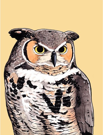
Inspiration
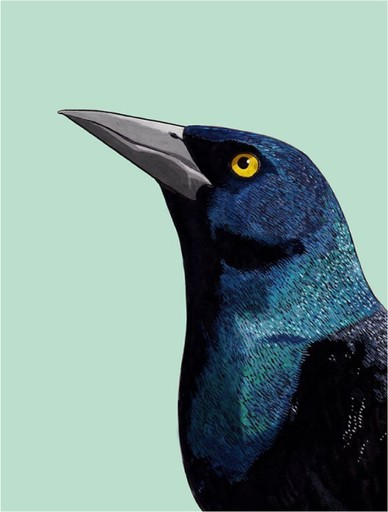

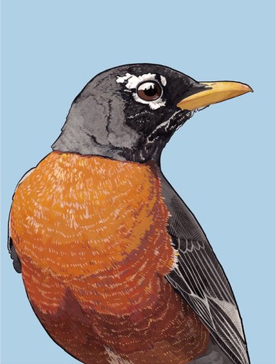

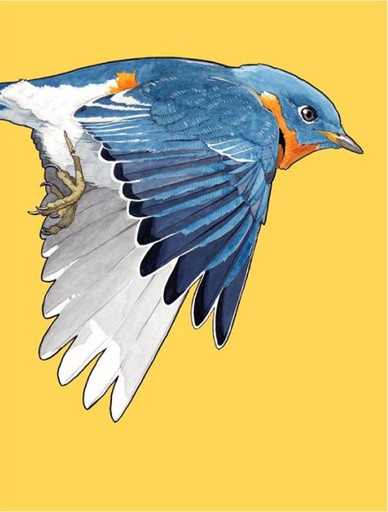


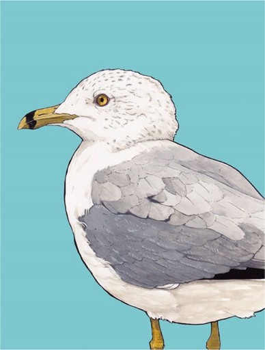



First version
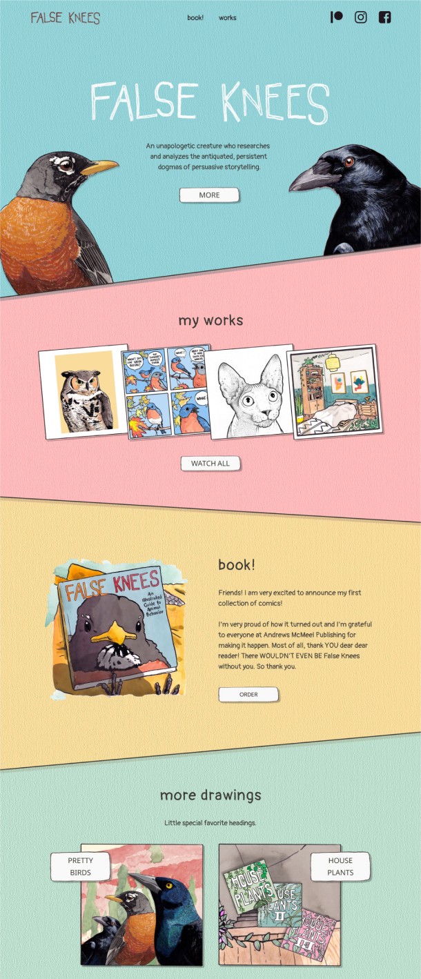
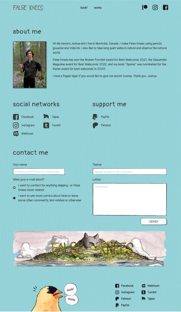
At first, I experimented with using all the chosen colors simultaneously, to make the site looking as a scattered colored paper adorned with sketches.
At first, I experimented with using all the chosen colors simultaneously, to make the site looking
as a scattered colored paper adorned with sketches.




Review
Old version has shown itself to be not at its best. The white navigation elements did not attract enough attention.
The color scheme was not expressive enough. Contact page was unnecessary.
Old version has shown itself to be not at its best.
The white navigation elements did not attract enough attention. The color scheme was not expressive enough. Contact page was unnecessary.
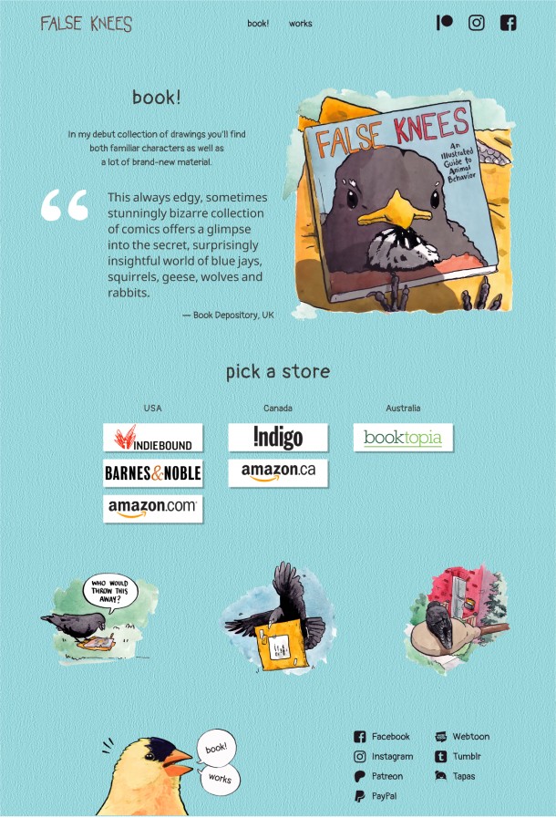
After collecting and analyzing feedback, I created a second option.
After collecting and analyzing feedback, I created
a second option.
Before


After


Before

After

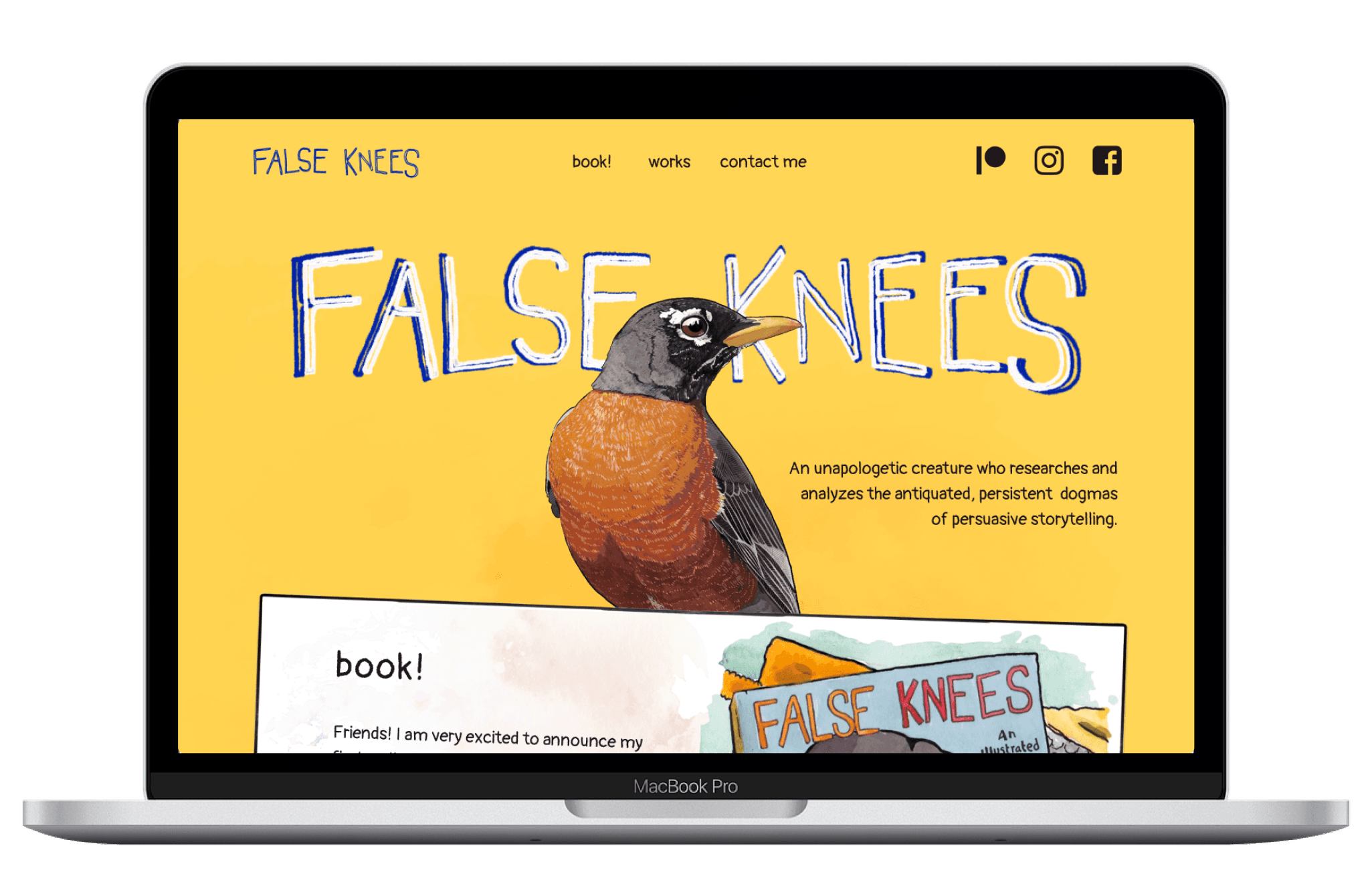
Final result
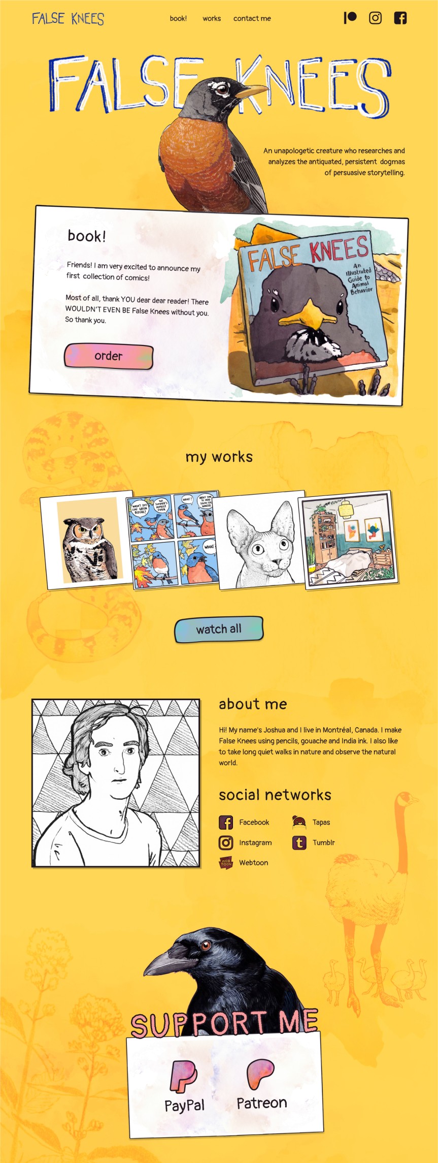
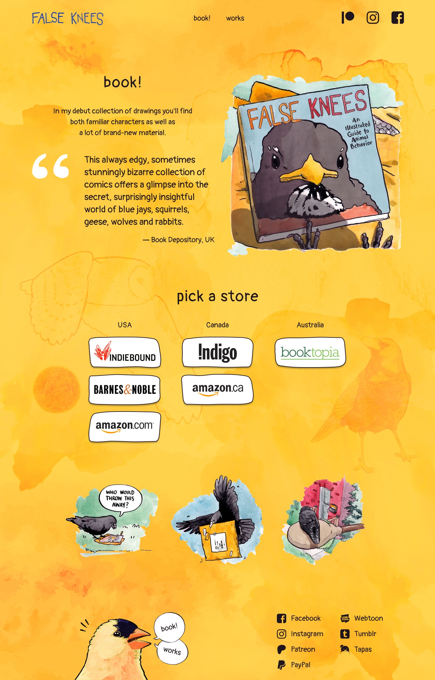
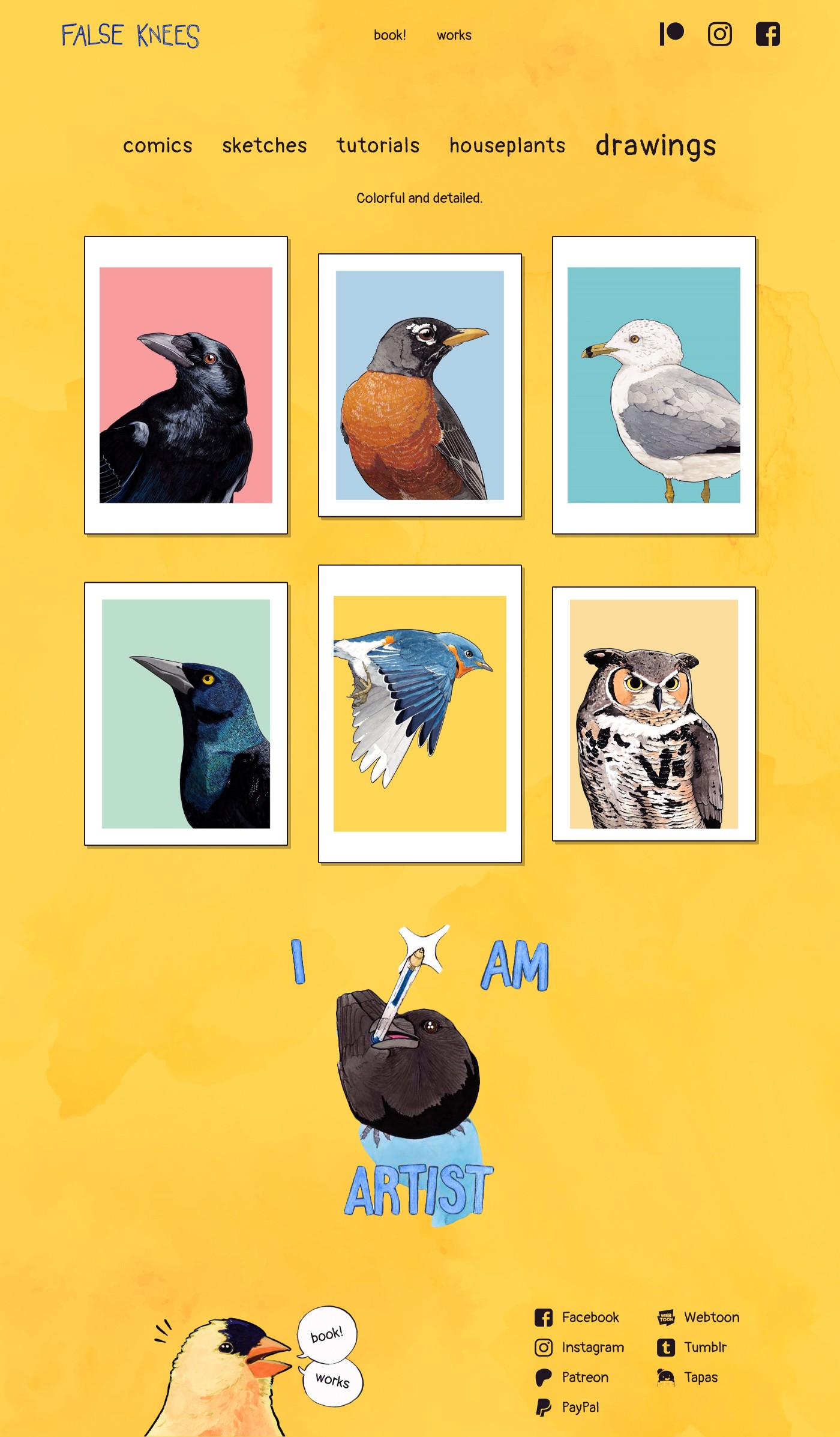
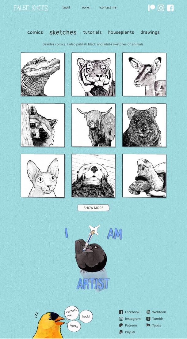
In the new version,
I eliminated the contact page, directing all visitors to the main page.
I emphasized the offer to support the author with color and graphic elements.
I emphasized the offer to support the author
with color and graphic elements.
I retained the yellow color and restored it to its previous saturation, complementing the background with illustrations and a watercolor texture.
I retained the yellow color and restored it
to its previous saturation, complementing
the background with illustrations
and a watercolor texture.
